I wanted to share with you what I feel is the perfect way to spend a day, most especially a wonderful Sunday. My good friend of many years Shane McDonald has began a figure painting group on the weekends at his studio located at the Artists Resource Center in Marietta Georgia. Shane and I have known each other for years and began our friendship through a group he hosted for almost 15 years. Over the years I've found a home with that group of artists and have come to view them as my family. It is for me one of the strongest connections to any group of people I've thus far enjoyed in my life. It is also where I happened to meet the love of my life, the lovely Ms. Goodman, "aka the LMG". Though time keeps marching on and relationships and friendships change I still feel deeply connected to the members of this group. We've all seen each other through the ups and downs of life and have a long and comforting history with each other. With the help and support of each other we have all grown and improved our skills as artists and visual thinkers. I was raised as a military brat and was constantly on the move for most of my early life till I reached adulthood or at least I was able to vote. A gift like this was something I thought I'd never have or expected. Thankfully, I've settled down a little in my life and proven to myself I could indeed have some long term relationships with other humans. I credit this mainly to the fact that they are a very tolerant group who has learned through the years that some music, laughter and good times making art and the addition of a few glasses of wine can see us through almost anything. It is to each of them I wish to say many thanks my friends!
.
We seem to always follow the same process each week during our 3 hour session. We begin with a series of gesture drawings lasting approximately 2 minutes each. This is a clay coated panel I was using and attempting to capture the proportions and movement of our lovely model Stephanie. Some models I find I always get a great session from, others not so much. Stephanie was someone I hadn't worked with before today and I will tell you unabashedly that she was magical as a muse to me and others in the group. She was graceful and fluid in her movements.
Just perfect! I prefer to paint generally and I always use a brush and a little paint to do my gesture sketches. I've been fairly successful at selling many of these, as they become rather abstract representations of the human form. I try and take a little care in composing the page out of these short poses.
Once we are warmed up so to speak we move on to a long pose which the model will hold for the rest of the session in 20 to 25 minute intervals. I was very happy with this effort and it came together rather quickly. I mainly concentrated on the figure, mirror and placing the carpet. After the model left I added much of the background elements. I was working on a clay board panel for this piece as well and I have to say that this being my first time trying them, I found both good and bad things about the surface. The clay quickly drinks in the oil mixture, which makes it harder to manipulate or change. The good news is that this cuts down on the glare from the lights which might be useful for painting outdoors. I found that until I had several passages of paint on the surface it was extremely difficult to move or blend the paint. Even with a rather thick passage it was not long before it sat up and became difficult to work with. Over time if I keep using this material I'm sure I'll find a work around.
So thanks for checking out my blog page and pass this on to anyone you think might benefit.
I'm always happy to hear form you and welcome your comments.
Till next we meet, I wish you laughter, love, good food, music and plenty of art!
Chazz
Monday, September 26, 2011
Monday, September 19, 2011
Step by Step, painting demo
Demonstration: Landscape Sketch in Acrylic
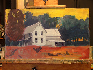
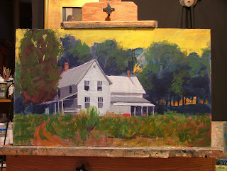
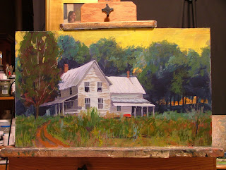
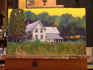
At times you may want to work quickly on an idea and experiment with color or design in your paintings. I find it helpful to sketch in acrylic paint at times because it dries so quickly and is easily covered over if you decide to change something. This is a demo of a painting I produced from reference photos I took when on a trip recently. Normally I would have spent sometime doing a sketch plein air and then taken it to a larger painting in the studio but for what ever reason didn't have the time to complete a work on location, so a photo is all I had to work from and my memory. The photo was somewhat flat and taken in the middle of the day which wasn't very interesting or appealing at first but I kept going back to it thinking I wanted to do something to make it more dramatic. I decided to change the time of day and mood of the piece by altering the color scheme and pushing the side of the house into deeper shadow than was indicated by my reference. This five step demo will give you an idea of how the painting developed and how I went about creating a more interesting painting.
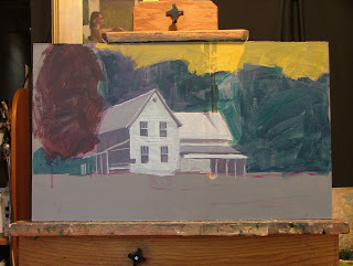
Step One: I blocked in the large masses of the painting on a gray background dividing the panel in to four distinct areas (sky, tree line, house and foreground). Each of these blocks were laid in with a broad brush and not much time was taken to develop any except the house which for me would become to main focal point of the painting. As I mentioned earlier, I didn't intend to stick strictly to the photo reference so I changed the color of the sky to a strong yellow instead of the light blue I saw in the photo. I also pushed the shadows on the side of the house into deeper shadow than was indicated. The base color for the trees was laid in with a very strong cool green tone to contrast the vivid yellow sky. The house was also altered in color slightly with the addition of some yellow in the mixture of white and raw umber to the light side of the house and violet to the darker mixture on the side of the house. I often will play with contrasting direct complements when painting and find it adds some vibrancy and excitement to the painting.
Step Two: I began to develop each area of the painting further with the addition of some stronger dark and light areas in the tree line, house, large tree in the middle ground and foreground areas. In the foreground I placed a broad wash of red orange as a base for the foliage I would later place there. In the tree line I broke the mass up and placed some open areas to indicate that you could see the sky peaking through in areas. The original photo had none of that so it was something I fabricated from my experience of painting outdoors. I also began to break the mass of the tree line up into individual trees by altering the color and value in areas slightly.
The foreground was a base color but I wanted to break it up some how and make it more interesting than just a band of color across the bottom one third of my panel. So, I began to place some darker abstract shapes in it which later would become the addition of a road back to the house which didn't exist in the reference photo. The house got a few deeper shadows and I began to develop the openings for the windows and wood siding on the face of the house.
Step Three: I continued to develop each area of the painting with the addition of lighter values of color and indication of foliage to the foreground area. Finally you could see the road developing and masses of high weeds in the field. I also continued to push some lighter color mixtures into the tree line and large tree in the mid ground. I took a good deal of care to clean up some of the edges of the house and accurately indicate some of the architectural features of the old house which helped to give it some character and a since that it had been there a long time.
The sky also got some thicker passages of color and the shape of the tree line began to develop nicely.
Step 4: With the addition of even lighter values in each area the painting finally begins to come to life. Each area begins to sit in its place nicely and support the illusion of the others. I particularly focused on the house adding some cast shadows and weathering to the wooden planks the house was built from.
Step Five: The illusion is complete after the refinement of some of the grasses in the foreground and additional cool and warm indications on the house. I also popped in some stronger lights coming through the trees. This is a much different image than the original photo reference and one I feel is stronger as a painting than if I simply faithfully copied what I saw. We as artist are not cameras or copiers. We are not tools that simply reproduce what we see. At some point we as people have to begin to make the images we create something more of an expression of what we feel. So for me, taking this painting to a different conclusion than a camera would have come up with is part of the natural process of creating a piece of art.
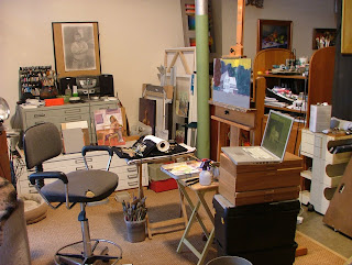
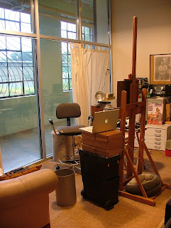
The painting is in the early stages on the easel and you can see the image on the screen of my Mac laptop from which I was working. You can also see that the studio isn't the most organized and neat environment which is fine by me, it's a place to work, think, read and listen to music.
A place to play, risk and fail miserably sometimes and yet have great moments of insight and joy at others.
Where you work does make a difference in my estimation. I'm fortunate to have good light, equipment and space to create art in. Of course I've built my life around that for years, so not living in a space with adequate light would be a foreign concept to me. I love my 16 foot tall windows that face north. I also like the fact they set inside the hallway of this old factory I live and work in. It affords my neighbors a chance to stroll by and see what is on the easel from time to time. The studio is not always a well kept place and I do have my projects laying around. I also provide places for my four legged roommates to hang out with me while I work. The conversations are rather limited with them but I enjoy their company non the less.
So, happy painting, do some good work and laugh and smile a little each day!
Feel free to stop by and chat if you should find me along a road side doing what I love best.
Till then!!!
Monday, September 5, 2011
Painting, Painting and Painting over the holiday!!!
Plein-Air, Paint faster the Light is changing!!!!
Plein-Air is I think one of the best ways to speed up your painting technique as well as sharpen your eye to value, color and proportions. Call me crazy but standing outside, working on your tan and slapping some paint around is a great stress relief as well. You have to make a decision and stick with it till it's through.
The OverLook at Vinings at Sunset
Painted on location, this spot offers one of the best views of the city. Once the sun begins to set the lights on the buildings begin to kick in and make a spectacular view.
The Highlands Atlanta GA,
This view is looking east from the top of the ridge. It was around 6:45 am and the sky just lite up with all this color. It was like magic to see the sky light up that way!
Botanical Garden Plein-Air event.
These small (6X9) canvases are handy for quick plein air studies. Atlanta Painters Meetup sponsored this event and it was such a good time.
Alla-Prima rocks in the Studio around 5am each morning.
My Natural Collection
This oil study took over 4 days to complete which by my standards is a long time. I did enjoy painting the bugs etc. They behaved themselves and didn't walk off anywhere!
"Coming Unraveled Around You"
This is another one of those little comments I keep making about human relationships, especially between men and women. For me, this is about that sense of excitement one gets when meeting another person whom we find irresistibly attractive. You know the one, somewhere between excitement and nausea. I'm taking an Alka-Seltzer!!!
Playing with Acrylic Paint as well!!!!
"Don't Turn that Page"
This painting was started at a figure drawing session some years ago now but never completed. Since I had the acrylics out, I decided to add those final touches that would make it feel finished to me. I really like how immediate you can be with the paint and keeping a loose brush helps from making the media seem too stiff.
"Cherokee Farm House Sunrise"
I seldom paint from photos any more but in this case I did and also worked in acrylic paint. I was very happy with this little rainy day painting. On days with poor weather or during the winter I have a file of around 200 photos of things I'd like to get around to painting. I don't know that I'll ever get around to them all, maybe I should take a year off and just paint till I complete them all? You'll see this painting on a later post. I have photos of the process in progress and will go through the step by step process, soon I promise!
Avondale Arts Festival Poster:
I painted this image plein-air a few weeks ago at the Piedmont Arts Festival specificly to submit to the Avondale Arts Alliance to use on their Autumn Arts Festival Poster. The good news is that it was selected and we will have the unveiling on September 21st. Hope you can join us!!!
I tried to keep the shapes simple and values and colors with a higher degree of contrast to help in the reproduction of the painting. My background as an ex-Art Director is paying off still. I look forward to seeing what the Designer and Printer do with the piece.
Close up shot showing how simple paint strokes pull together to make images of people walking among the tents. No real detail here! Simplify, simplify, simplify!!!
The final image achieved what I set out to create and it was both a challenge and fun to hold back from adding details that I didn't need and would actually make the painting less accessible to the viewer.
Once again, thanks for your comments, support and well wishes. Keep painting, collecting art, or just passing it along to the next generation.
Chazz
Saturday, July 30, 2011
Hmmm, more paint and laughing about it!
"We might have to break a few eggs"
These are some things I've been recently working on. I still try to do a painting a day but seldom really get around to it. The weekends seem to be a better time for me so this is a little effort I made on Sunday morning.
"Vincent is dancing in my head"
This is very impressionistic and has a bit of paint on the surface. Vincent might have painted this if he were sitting in my studio.
"Late afternoon at the beaver pond"
This was painted plein air with my class of senior students from the Benson Center.
They enjoyed the day as I did and I think in spite of the painting being mainly green, we got a little color in there.
"Roses for my love"
A bit romantic, maybe! Nice paint surfaces though and rich color and contrast.
Thanks for taking a look! Keep making some art in what ever form you choose!
Chazz
Sunday, July 17, 2011
Movement and Motion
Hi all,
Hope your enjoying a few of these wonderful summer days which have been rather cool and pleasant considering we are in Georgia. I wanted to talk to you a bit about some of the work I've been working on over the past year. As most of you know I've gotten my hands in the mud for the first time in many years and have been enjoying it. My early pieces were just a bit stiff in my estimation so I've been trying to get a little more motion in my clay works as well as pushing the size and engineering boundaries of the material. Take a look and see what your thoughts might be.
I'd enjoy hearing back from you if you have any comments, so ....... on with the show!
This piece was a difficult one to get to work. It's large and heavy!
Wrapping the Koi around this Vase helped to give it a fluid motion which works from all sides.
I was very happy with this one
This was an earlier success in my view. It has a lot of motion and the texture and patterns help carry this illusion. Unfortunately, she wasn't structurally very strong and was easy to break. So back to the drawing board.
Thursday, April 28, 2011
In Case Your Wondering, I've been playing in the mud!
Hello everyone and please excuse the long absence from me posting anything on this page. I really don't have any excuse except that I've been focused on working in a new media other than paint. Like most of we creative types, I get an itch to explore things less familiar or safe and take a chance on getting frustrated or even down right falling on my face. I've done that a few times as you'll see in the following photos with a media I've always been curious about, clay. I like the correlation between sculpting and drawing and how they both make one stretch their ability to think in 3D. I've always liked the unpredictability of clay and the way it kind of does it's own thing and one has to adapt and grow your original intent to fit what the clay wants to do. I've learned much since the beginning of the year and would like to show you what I've come up with, so on with the show!
A pair of "Love Birds" which are more sculptural in form and something I was very happy with at first. The glaze is actually a darker blue and should be more matt than glossy. Unless one looks very closely it appears to be black. I'll be doing more of these as time goes on as I feel they could be a popular theme.
This is a simple ball shaped bowl with the addition of a Mermaid. I'll be doing a few pieces along this line as I'm seeking a gallery in a coastal area. I also just like the mythology behind mermaids and being an ex-sea going sole, they hold a fascination for me.
This is a simple tower design with a mermaid wrapped around it. It came out well and it has a really good feeling to me. If I were being critical of my recent work in clay, it would be that I'm not fluid enough with it and tend to over clean and detail my pieces. This piece though has a certain immediacy to it that I feel is more what I'm hoping to incorporate in my work.
This little effort is about 12 inches tall and is a simple ball shape with a tower rising from it. I've added Koi and Lilly Pads as well as a texture reminiscent of water to the surface. This is a fairly standard classic form but with the decorative elements added it takes it to a level that reminds me of pieces created in the Art Nouveau or Arts and Crafts style of the late 1800 and early 1900's.
This enchanting little bowl ( 14" wide and 10" tall) was an idea I came up with and was pleased with the conceptual aspects of the form and the way I engineered it. Unfortunately, she has her problems and the piece came out less than perfect (Ha)! She does have her charms though and I feel the proportions of the Mermaid to the open bowl area is very pleasing. The shape is a little rough though and I wanted to try her at a larger scale. I'm trying to push my ability to work with this material into larger pieces as you will see.
This is the larger attempt, about 20" long, 16" tall and 14" wide. The engineering aspects of this piece were more successful in ways but the aesthetics are not quite as pleasing to me as the first piece. I will be trying this again as I wish to perfect the concept and form into something unique in my work. The size and scale of this piece really pushed the limits for me at this time but I'm sure I'll try an even larger piece.
Again, along the mermaid theme, I've tried a very vertical form at a large scale. The piece is about 22" tall. I was very happy with the matt glaze I applied to most of the piece over the brown clay. The flesh areas are a bit darker than I would have originally hoped for. Color with this material is a whole other exploration, so I think I'll try and keep it simple for a while till I can experiment with it a bit more.
This little spring goddess is one of the most difficult challenges I've taken on to date. I love the fluid motion she has as well as the sense of joy and abandon. I envision a larger piece incorporating 8 to 10 of these figures. It's just an idea at this stage.
This was a piece I came up with on a whim, incorporating a little nude study into a functional piece which serves as a watercolor palette. I was pleasantly surprised at how well she came together! It will inspire me to work with watercolor more often I'm sure.
Saturday, January 22, 2011
Avi and Andy, Commissioned Portrait
"Avi and Andy"
Oil Painting on Canvas 24 X 36
Painted from life and photo references.
This is the most recent portrait commission I have finished. I delivered it yesterday and the client was very pleased. It's great when that happens and I'm enjoying the moment. I want to be appreciative to this client because as John Singer Sargent said "A portrait is a painting with something wrong with the mouth". This seems to be all too common a reaction to a painting which has been commissioned and finding a client who loves the work as much as you do is a blessing.
I'd like to take you through the basics of the process on this project so you'll get an idea of how I work with clients. It will cover more of the steps on how I work with people than with the actual painting but will be brief and helpful, I hope.
First I met my client and we discussed things like what the painting was going to be of and who would be included in the piece. We also discussed pricing and I gave them a rough estimate after I did some thumb nail sketches and showed them what I was thinking. This was done in their living room and when we concluded meeting everyone seemed to be on the same page. I think this was the most important step in the process because it set the level of expectations and gave them a chance to tell me what they thought was the most important things to them and what they were hoping for. What was requested was a painting of Andy (the grandfather) and Avi (the grandson) in a basic head and shoulder length painting. This seemed to lend itself to an unusual proportioned portrait, one that sat more landscape like than portrait. They also wanted to express the close relationship between the two subjects and having them side by side seemed to graphically display this. We arranged a time to meet the subjects to begin the process and a one third deposit was made on the painting.
First Sitting:
Several days later I met the subjects in my studio. I had them take several poses together to look at the composition and did an initial sketch of each to become more familiar with each of their faces. I find this first sitting critical because it gives me a chance to begin to know my subject as an individual. The discussion might go in any direction but mainly stay about their life, goals and some of their unique experiences and views on life.
Avi and Andy the first meeting and beginning to look at the layout of the painting.
Very quick sketches were made of each of the subjects. This was to start the process of me getting familiar with each of their faces. I gave them the sketches after the session was over as they were not going to be part of the final painting and it gave each of them a sense of how I was seeing them at the time. I think this is good PR and builds some trust with the client early on with little or no risk to the artist.
The Second Sitting:
One critical thing that was discussed was clothing on the subjects. In a head and shoulder painting often only a minimal of clothing is indicated. In this case though I wanted to bring the clothing down a bit further to fill the canvas so it became an important element. I decided to have one wear a solid color and the other a pattern for contrast.
At this point the painting became clearer in my mind and though I had an initial rough in on the canvas I began to change and refine the placement of elements on the canvas. By the end of this session I was much happier with the layout and color scheme which was beginning to develop. I kept working on the piece till I got to the point where all the major blocks of color were in place and the piece began to take on a likeness of the subjects.
Third Sitting:
I had each of the subjects come down to my studio individually and spent time developing the likeness further, correcting information and trying to get a better tonality to the flesh colors.
This also gave me a chance to really personally connect with each of them and get a better sense of who I was painting.
I showed the client the painting before the final stages to see if we were still on track and the response was very positive. It helped build the level of anticipation of the finished piece and when the final piece was viewed there was little chance of any big surprises on anyone's part.
I let the painting dry a few days and painted the edges of the gallery wrapped canvas, added a paper dust sheet and wire so the piece could be temporarily hung until the client had time to frame it. We discussed leaving the painting unframed, but it is a rather traditional looking portrait, so my feeling is that it could use a frame, the right frame of course. That will be the next adventure in the completion of this painting.
I hope this is helpful to anyone who takes on an assignment like this. Portraits are always a challenge and having a process to follow will be a great help to you I hope. Till then, happy painting! Stay in touch and let me know how you do!
Thursday, January 6, 2011
Wanted to share this! The way we see things can make a difference!
A friend sent me this and I thought I'd pass it along. It will make you think a bit about the world and the way we see it around us.
Best Wishes and a Happy New Year
Chazz
A palindrome reads the same backwards as forward. This video reads the exact opposite backwards as forward. Not only does it read the opposite, the meaning is the exact opposite. This is only a 1 minute, 44 second video and it is brilliant. Make sure you read as well as listen forward and backward. This is a video that was submitted in a contest by a 20-year old. The contest was titled "u @ 50" by AARP. This video won second place. When they showed it, everyone in the room was awe-struck and broke into spontaneous applause. So simple and yet so brilliant. Take a minute and watch it.
Best Wishes and a Happy New Year
Chazz
A palindrome reads the same backwards as forward. This video reads the exact opposite backwards as forward. Not only does it read the opposite, the meaning is the exact opposite. This is only a 1 minute, 44 second video and it is brilliant. Make sure you read as well as listen forward and backward. This is a video that was submitted in a contest by a 20-year old. The contest was titled "u @ 50" by AARP. This video won second place. When they showed it, everyone in the room was awe-struck and broke into spontaneous applause. So simple and yet so brilliant. Take a minute and watch it.
Subscribe to:
Posts (Atom)